|
|
Post by [Qs]SöZe-l- on Apr 26, 2011 16:33:15 GMT -5
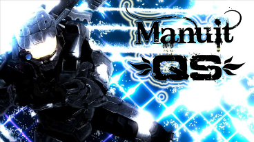
Did this in 5 min  |
|
|
|
Post by Manuit~[QS] on Apr 26, 2011 18:13:42 GMT -5
nice one mr.soze but dem name text font;style doesnt go with it.
|
|
|
|
Post by ♫♣Johnmusic♣ on Apr 26, 2011 18:26:46 GMT -5
Did this in 5 min Again, your text is utterly horrid. Also, the 'D.U,M.' Should be less noticeable if it's going to be your trademark, seriously. The signature itself is meh. I like the render, although it looks overly sharpened/brighten and darkened.(Adding to the curves you call it. I say it looks gross and you ruin the render with the degree you put it on.) I see you added some C4D's for the background, trying to create movement. It's not bad there, but it definitely could have been better. |
|

![[Qs]SöZe-l- Avatar](http://fc03.deviantart.net/fs51/f/2009/310/b/9/Anton_Levay_by_DRVSTR666.jpg)

![Manuit~[QS] Avatar](http://upload.wikimedia.org/wikipedia/commons/5/55/Tesseract.gif)

![`SNΞΔKY_[QS] Avatar](http://i447.photobucket.com/albums/qq195/qssneaky/ALEX3.jpg)